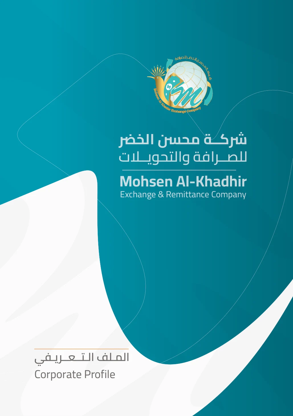
01 / THE STARTING POINTThe logo was the starting point.
The logo was the starting point.
The profile was my design.
 HOOPOE / VISUAL DNA
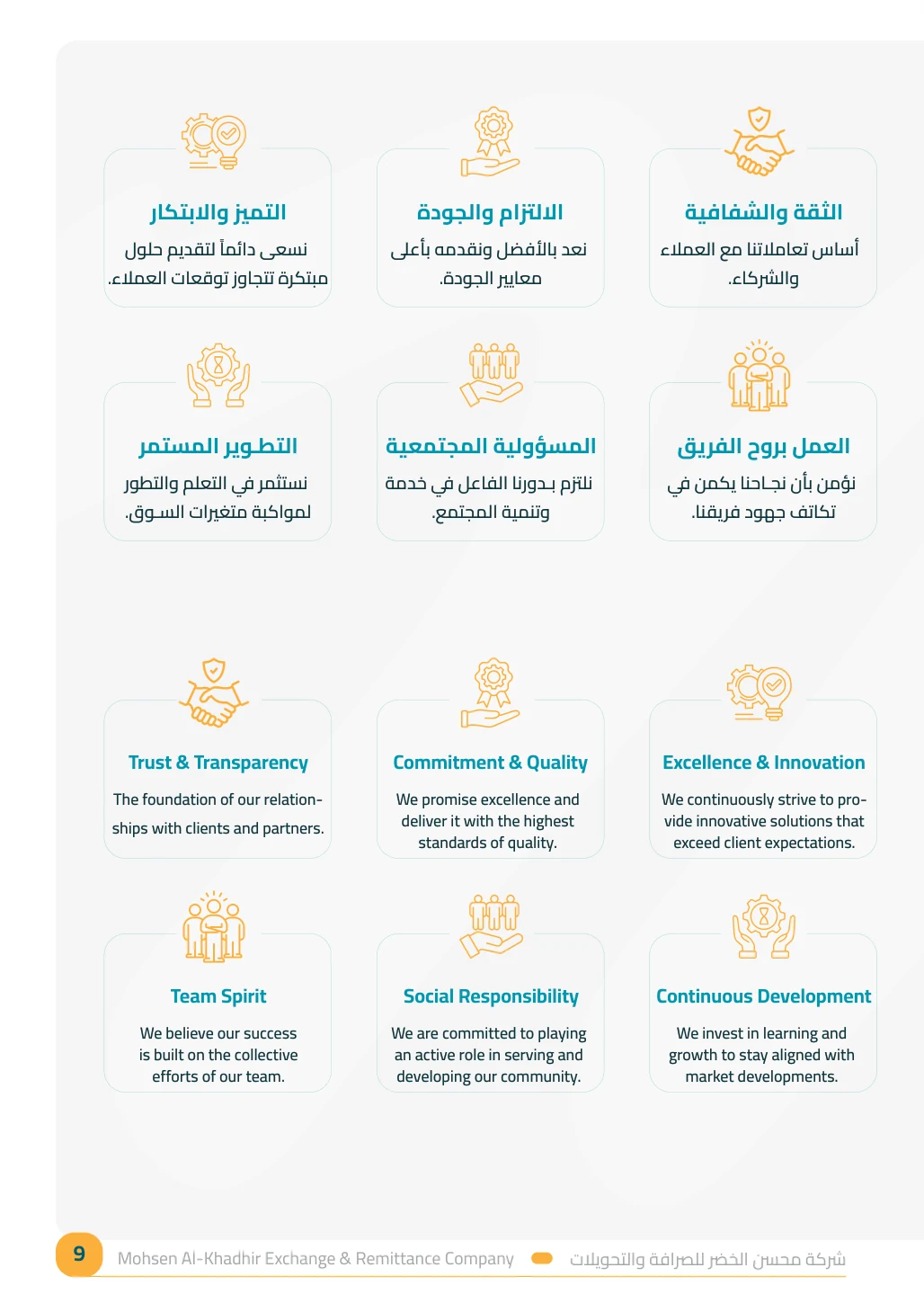
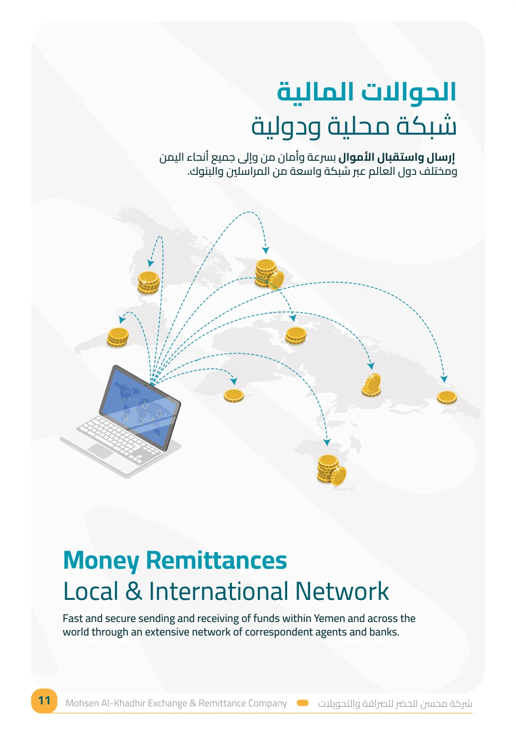
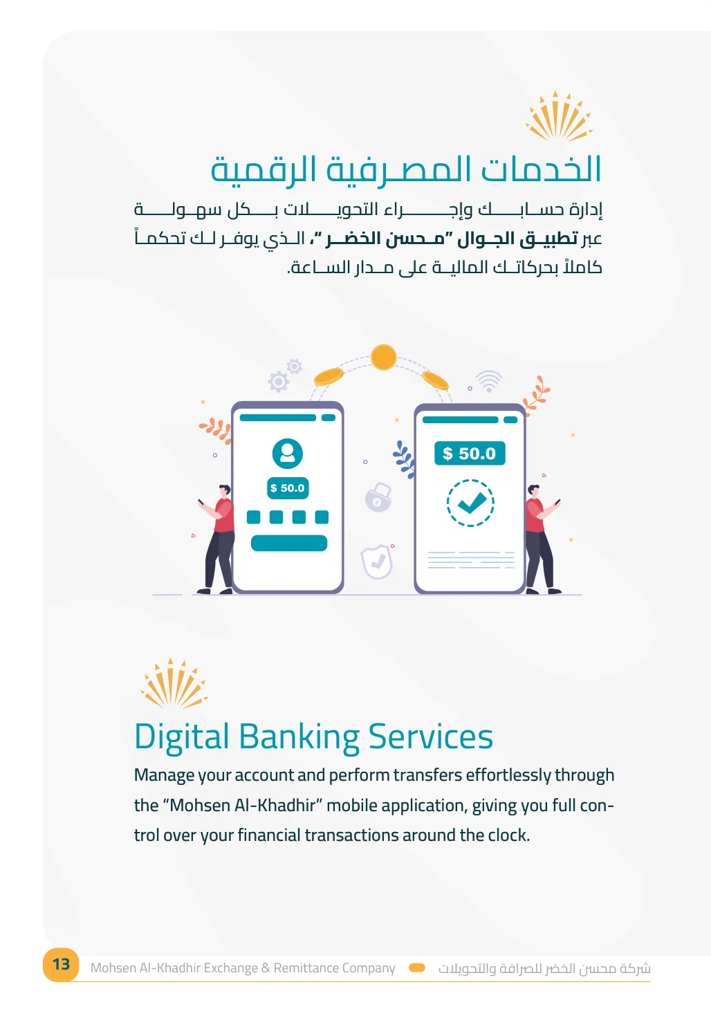
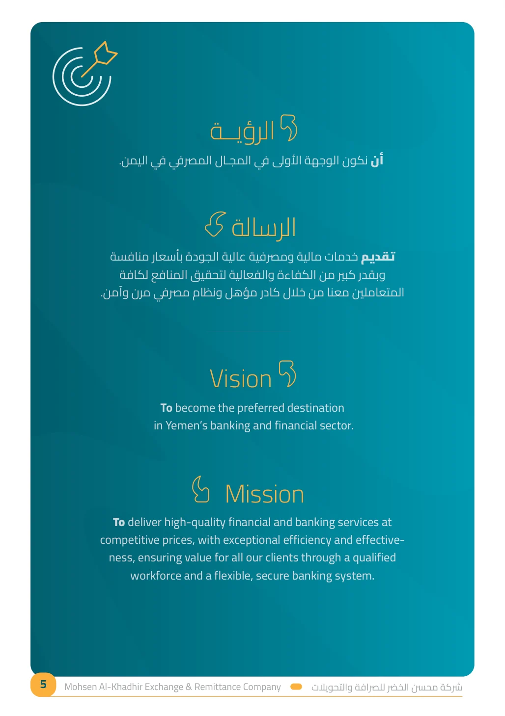
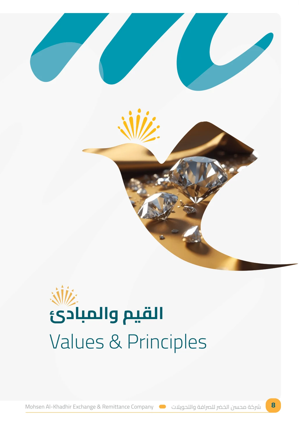
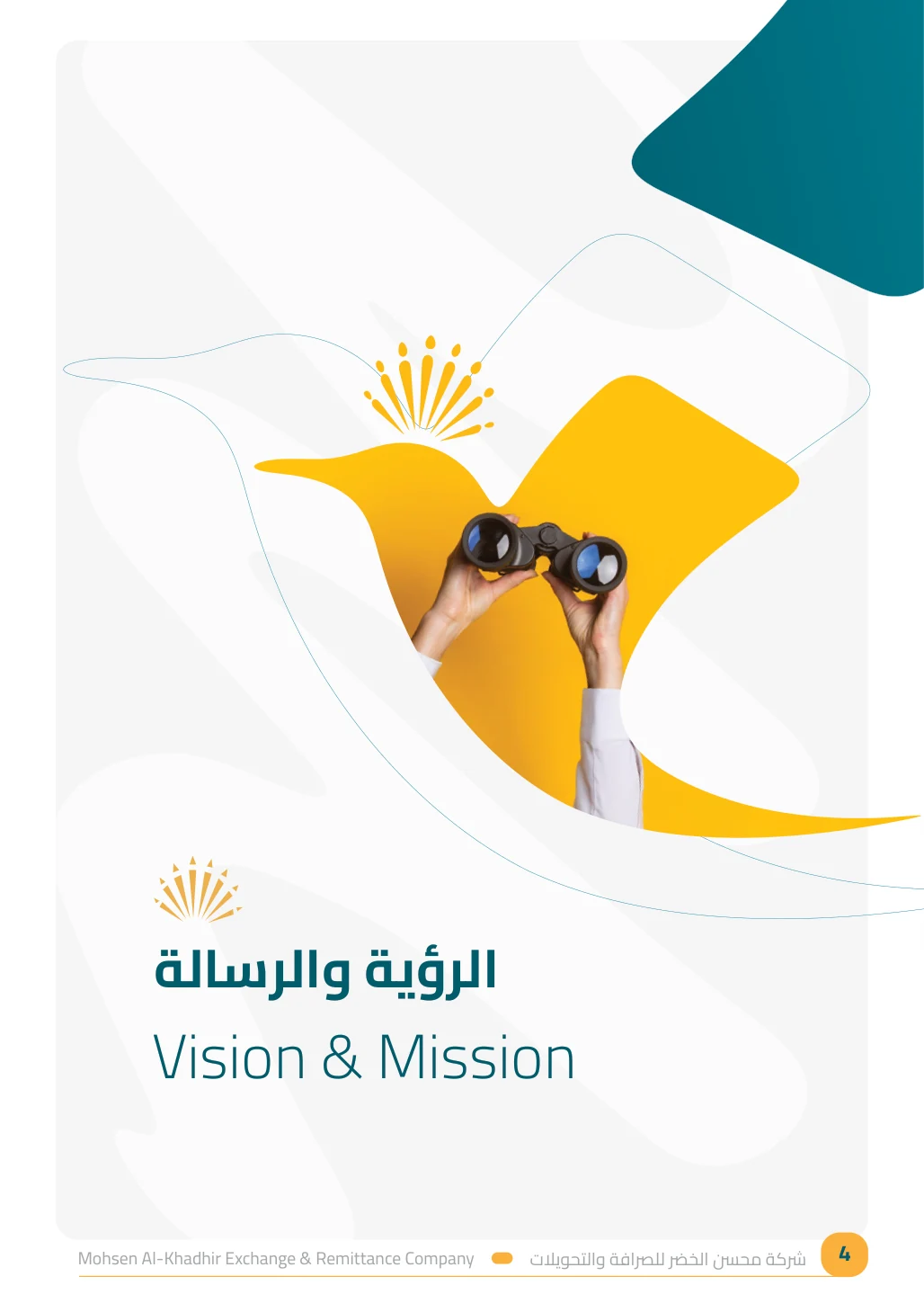
I did not design the company logo. But I found a distinctive design opportunity in its existing hoopoe mark: flowing lines, expressive image windows and a recurring visual motif that could unite the profile without feeling repetitive.
Rather than simply placing the logo above each page of text, I interpreted the bird’s form as an editorial system that connects the chapters and makes each section feel intentional.