When a page becomes
a window into a place.
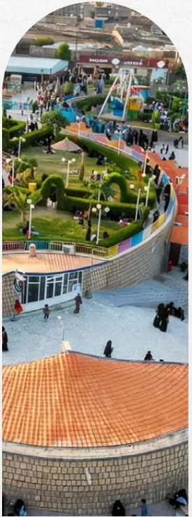
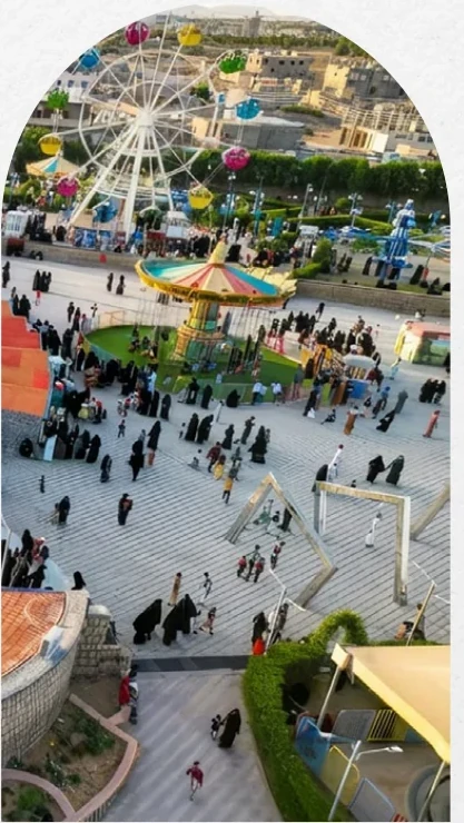
I designed the company profile for Green City Park in Marib, Yemen, combining real photographs of the destination with architectural arches and Sabaean-inspired motifs to build a distinct, readable bilingual presentation.
Explore the design approach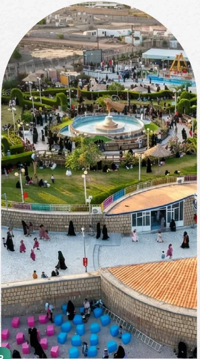
I did not design the park.
I designed how it is seen.
The assignment was an editorial profile for an entertainment and cultural destination in Marib. Its visual story needed to hold two things together: contemporary visitor experiences and the historic character of the region. I gave photography enough space to create an immediate impression while keeping institutional information structured and readable.
Repeated arches, fine-line ornament and geometric rhythms connect the spreads without flattening their individual character.
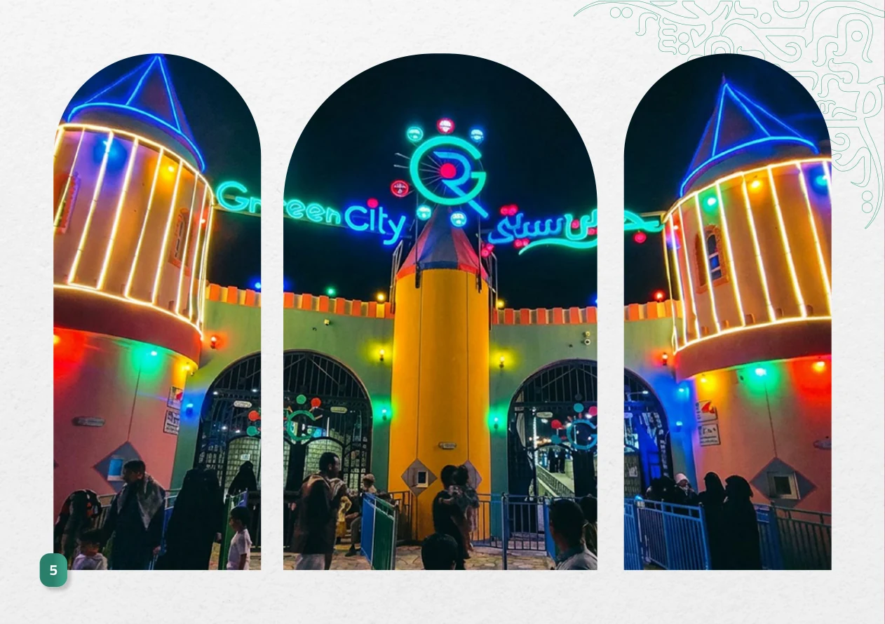
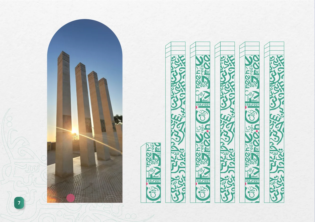
Arches frame the story.
Color gives it rhythm.
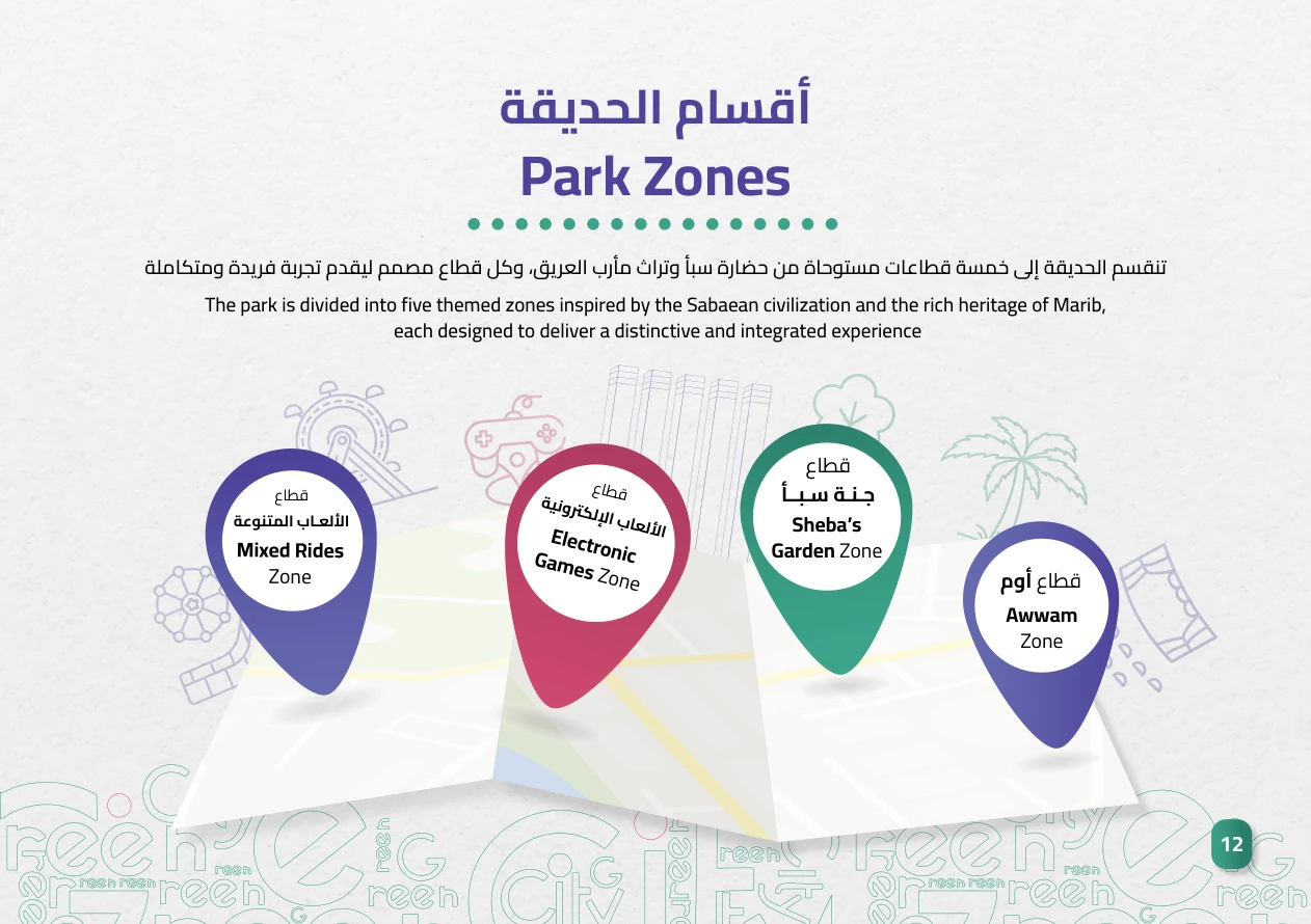
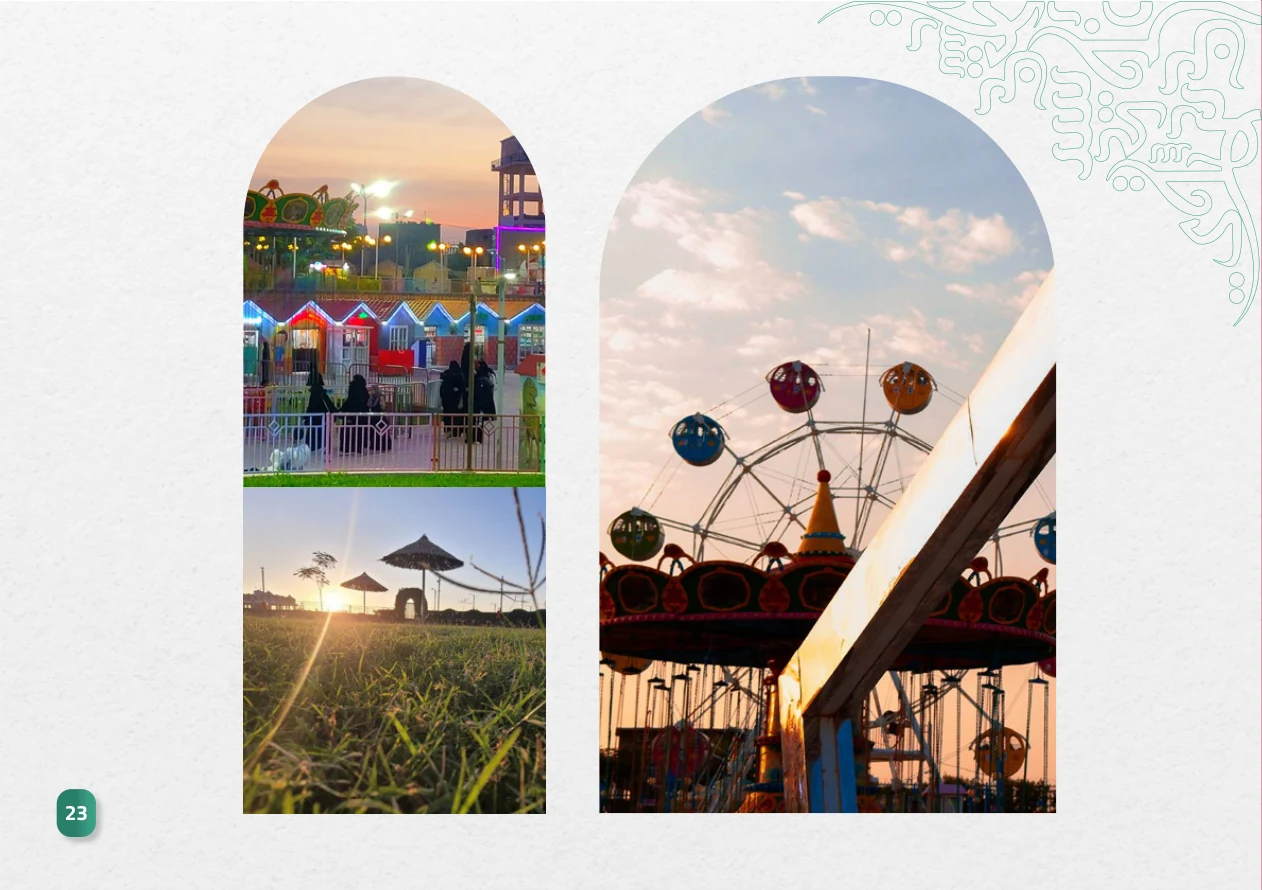
Arched windows focus attention on photographs while generous white space alternates with green, violet and pink chapters. Heritage-inspired line patterns stay in the margins: a subtle connection to the place rather than decoration competing with the information.
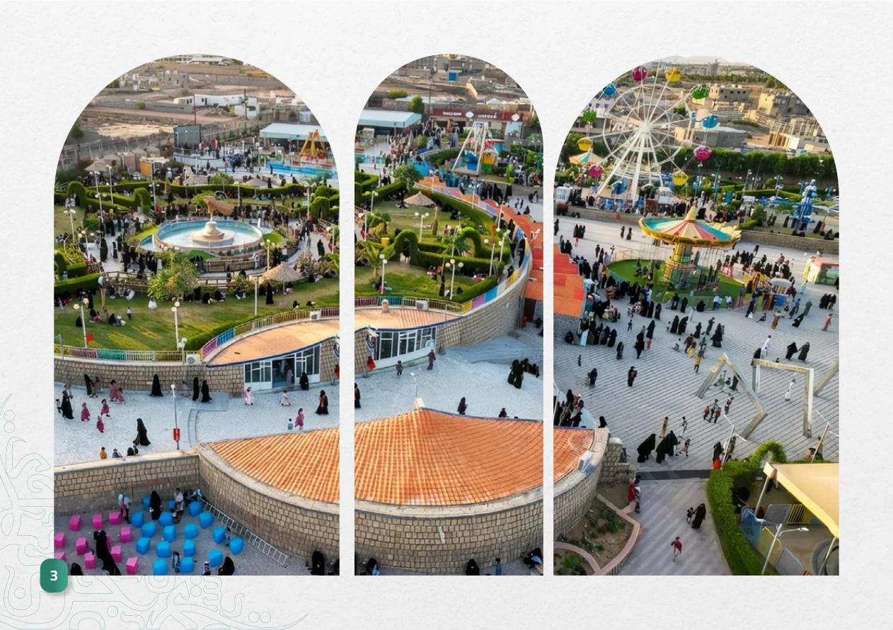
Each chapter changes pace.
The visual story stays connected.
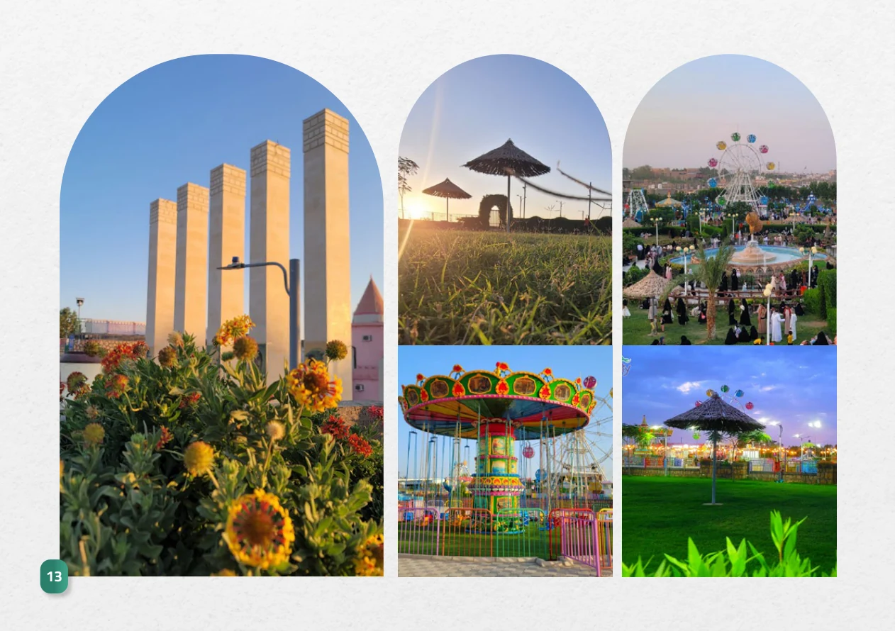
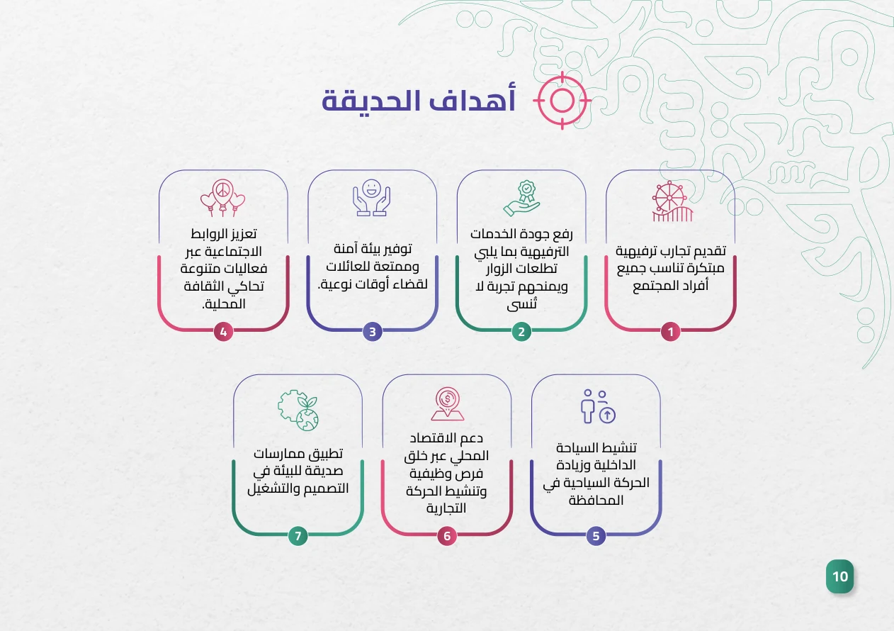
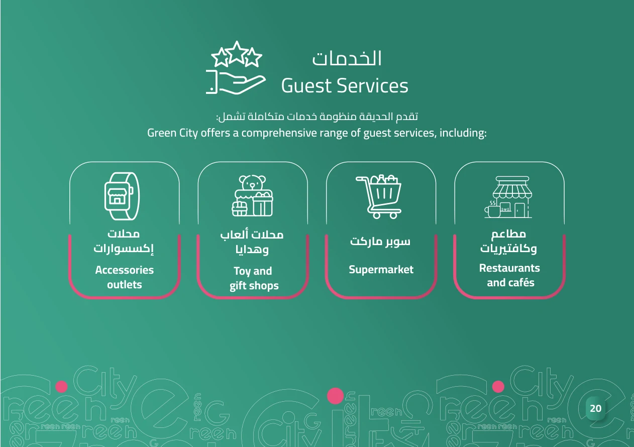
The profile moves between large photographic impressions, editorial pages for the story and vision, and diagram-led pages for services and facilities. These alternating densities help readers move from atmosphere to detail without visual fatigue.
GREEN
CITY.
Digital print-style spread using authentic pages; not a photograph of a printed copy.
24 pages.
One visual journey.
Browse the original design page by page. Choose a page number, use the arrows, or enlarge an individual spread to inspect typography, imagery, and layout.
These pages belong to the company profile I designed. The destination, its photographs, facilities and underlying statements belong to the project owner.
 24 PAGES / ONE STORY
Design that lets the place
tell its own story.
The editorial deliverable is a 24-page bilingual profile combining arches, photography and Marib-inspired details in a cohesive layout system. The creative contribution documented here is the design and presentation of the information, not the park facilities or architectural works shown.